|
|
Silkroad Online
|
|
|
Silkroad Forums
|
|
|
Affiliates
|


|
|
View unanswered posts | View active topics
  |
Page 1 of 1
|
[ 26 posts ] |
|
| Author |
Message |
|
Bakemaster
|
Post subject: Testing out shorter sig.  Posted: Posted: Fri Aug 18, 2006 6:33 pm |
|
| Senior Member |
 |
 |
Joined: Feb 2006
Posts: 4732
Location:

|

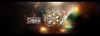
I was bored and Ryoko turned the profile options back on. Comments? I tried to make some text with the texture of the hunter flag, and then made it gold, and fooled around trying to make it fit better but I think I'm just going to change it to Arial 12 because it's barely readable at this size.
And yes, I realize there are no aWes0m3 bru5hezz or fX0rz, and it's "just" a cropped screenie with text and a border. Spare me the l33t revu0ze. If you consider yourself to be "pro" at signatures I am not interested in your opinion.
_________________
LOL
|
|
| Top |
|
 |
|
Snudge
|
Post subject: Posted: Fri Aug 18, 2006 6:47 pm |
|
| Banned User |
|
Joined: Jun 2006
Posts: 4200
Location:

|
I like it, plain, yet fancy.
I must agree on the font though, it's barely readable this way, perhaps look for an other font(maybe on sited, maybe you got some left) is you want to keep it this size, or just increase the size 
_________________
<<banned from SRF for proof of botting. -SG>>
|
|
| Top |
|
|
|
Rockshmo
|
Post subject: Posted: Fri Aug 18, 2006 6:51 pm |
|
| Frequent Member |
 |
|
Joined: May 2006
Posts: 1062
Location: rehab
|
|
Relax man, not every sig has to be uber leet with brushes or effects. And whoever says that is a moron..
It's still a pretty nice sig taking into consideration the castle in the back, the pose, and the camera angle.. it's one of the nicer "screenshot sigs" I've seen here. But you're right the text is a little hard to read although I'm sure it'd be a nice texture effect if the text was bigger.
Personally I really like your current one, everytime I pass one of your posts I pause for a second to look at it.
_________________

[Sparta][Pure STR][Lvl 5x]
|
|
| Top |
|
|
|
Bakemaster
|
Post subject: Posted: Fri Aug 18, 2006 7:16 pm |
|
| Senior Member |
|
|
Joined: Feb 2006
Posts: 4732
Location:
|
|
Sorry, that came out more hostile than I wanted. I'm a little touchy today about... stuff. I'll probably change the text, change the border to 1px white inside 1px black (like my current one), use the new one for a week and then change it back. I'm gonna make the one I have now smaller too, while I'm at it.
_________________
LOL
|
|
| Top |
|
|
|
FK47
|
Post subject: Posted: Fri Aug 18, 2006 10:39 pm |
|
| Valued Member |
 |
|
Joined: Aug 2006
Posts: 404
Location:
|
|
I can help you out with the text if you like. =D
The posing is cool though, me likes.
_________________

|
|
| Top |
|
|
|
CrimsonNuker
|
Post subject: Posted: Fri Aug 18, 2006 10:47 pm |
|
| Dom's Slut |
 |
|
Joined: Aug 2006
Posts: 13791
Location:

|
|
lol it looks funnnyyy
_________________
|
|
| Top |
|
|
|
Moogie
|
Post subject: Posted: Fri Aug 18, 2006 11:37 pm |
|
| Frequent Member |
 |
|
Joined: Jan 2006
Posts: 1344
Location:

|
It's a good pose and looks pretty shweet. People sometimes think they HAVE to pimp up their sigs with effects and brushes and fancy stuff, and just end up ruining what was already an attractive-looking pic on its own.
I would only say maybe fiddling with brightness and contrast a bit because the colours are a little desaturated IMO.
Kudos.
_________________


I actually did that thing in Mixmax's Sig!
|
|
| Top |
|
|
|
Bakemaster
|
Post subject: Posted: Sat Aug 19, 2006 1:18 am |
|
| Senior Member |
|
|
Joined: Feb 2006
Posts: 4732
Location:
|
|
Yeah I kinda feel that if I'm gonna have graphics from SRO in my sig, it should be because they look cool, so why cover that up? You're right about the colors, that'd be a consequence of taking the screenshot at sunset. I kinda like it that way, might change it, might not.
_________________
LOL
|
|
| Top |
|
|
|
Remco
|
Post subject: Posted: Sat Aug 19, 2006 10:11 am |
|
| Casual Member |
|
Joined: Aug 2006
Posts: 57
|
|
Plain sigs ftw! Brushes are not 1337 because other people maked them, except if you use your own brushes though.
Well done, how 'bout a 'lil touch text effect?
_________________

|
|
| Top |
|
|
|
Nannari
|
Post subject: Posted: Sat Aug 19, 2006 10:39 am |
|
| Regular Member |
 |
|
Joined: Apr 2006
Posts: 323
Location:

|

Kinda took the liberty to show what I think looks a lil better..
Theres quite a difference in the colors, no? Tried to fiddle with the text to make it look decent, but I just couldnt do that.
_________________

dom wrote: I never use more then 20~gb, and most of that is in porn alone.
|
|
| Top |
|
|
|
Moogie
|
Post subject: Posted: Sat Aug 19, 2006 3:03 pm |
|
| Frequent Member |
|
|
Joined: Jan 2006
Posts: 1344
Location:
|
Nannari: Woah, overkill there methinks. Just a -bit- too bright, to the point where it starts to lose a lot of detail.
Bake: Looking good. How would the text look in a more yellowish colour, I wonder? (like how the armour looks)
_________________
I actually did that thing in Mixmax's Sig!
|
|
| Top |
|
|
|
Nannari
|
Post subject: Posted: Sat Aug 19, 2006 3:12 pm |
|
| Regular Member |
|
|
Joined: Apr 2006
Posts: 323
Location:
|
Moogie wrote: Nannari: Woah, overkill there methinks. Just a -bit- too bright, to the point where it starts to lose a lot of detail. Guess its just a matter of opinion. If i take it a tad more, it really does loose detail, i spent 5 minutes trying to get the colour to the point where its really contrasty-ish and still not loosing too much details..
_________________
dom wrote: I never use more then 20~gb, and most of that is in porn alone.
|
|
| Top |
|
|
|
FK47
|
Post subject: Posted: Sat Aug 19, 2006 3:49 pm |
|
| Valued Member |
|
|
Joined: Aug 2006
Posts: 404
Location:
|
|
Increasing the contrast on the character and not the background, even by a small amount, would look good. And I still think the text could be better, much better.
_________________
|
|
| Top |
|
|
|
Bakemaster
|
Post subject: Posted: Sat Aug 19, 2006 11:16 pm |
|
| Senior Member |
|
|
Joined: Feb 2006
Posts: 4732
Location:
|
|
I thought about matching the text to the colors of the armor, but decided I like it better this way.
@FK: The character and the background are part of the same screenshot, same layer - don't feel like taking the time to cut it out and fiddle with it. If you want to do some text on it you're welcome to, but saying it could be "much better" doesn't really help me.
_________________
LOL
|
|
| Top |
|
|
|
FK47
|
Post subject: Posted: Sat Aug 19, 2006 11:23 pm |
|
| Valued Member |
|
|
Joined: Aug 2006
Posts: 404
Location:
|
Okay, I will.
Edit:

Hopefully the changes are noticeable, else I just wasted 20 minutes. ;p
Hope you like. =)
_________________
|
|
| Top |
|
|
|
Bakemaster
|
Post subject: Posted: Wed Sep 06, 2006 10:23 pm |
|
| Senior Member |
|
|
Joined: Feb 2006
Posts: 4732
Location:
|
|
Just found this thread again - I didn't mean to ignore you, FK, but I'm not wild about that text. The tall B and sunken E kind of skew the whole word a little, or at least it seems that way to me. Could work in another sig, but not the style I'm looking for, which is sort of blunt, blocky, guy-with-his-arms-crossed-don't-take-no-guff. If that is a style. Anyway I've decided to give my last revision a whirl for a little while.
_________________
LOL
|
|
| Top |
|
|
|
dom
|
Post subject: Posted: Wed Sep 06, 2006 11:56 pm |
|
Joined: Mar 2006
Posts: 9967
Location: västkustskt
|
|
Take the original, remove the texture on the text, make it white with that black backdrop, cruise around and pick up the girls.
_________________

|
|
| Top |
|
|
|
Bakemaster
|
Post subject: Posted: Thu Sep 07, 2006 4:11 am |
|
| Senior Member |
|
|
Joined: Feb 2006
Posts: 4732
Location:
|
|
You are too late! The girls are asleep.
_________________
LOL
|
|
| Top |
|
|
|
MapleShilc
|
Post subject: Posted: Thu Sep 07, 2006 5:40 am |
|
| Casual Member |
 |
|
Joined: Jul 2006
Posts: 78
Location: Vancouver
|
|
i go pif at your sig....
not enough contrast, try take screenshots in high, or user control(everything high) graphics, which will give a much better effect,
if you know ps well enough (not me...) you can try AA with mouse on your sig... or use corel painter, and re do the picture, so it looks more real, =D, but it prob will take a LOT longer time....
_________________
Ign, MapleShilc lvl 4x [Got Hacked >.<]
SakuraCherri lvl 2x [Got Hacked >.<]

|
|
| Top |
|
|
|
Bakemaster
|
Post subject: Posted: Thu Sep 07, 2006 8:00 am |
|
| Senior Member |
|
|
Joined: Feb 2006
Posts: 4732
Location:
|
|
I go pif at YOUR sig. Now what? WachaaaaAAAAA!
_________________
LOL
|
|
| Top |
|
|
|
Blyth
|
Post subject: Posted: Thu Sep 07, 2006 1:01 pm |
|
| Frequent Member |
 |
|
Joined: Jul 2006
Posts: 1025
Location:

|
It's a good sig Bake
|
|
| Top |
|
|
|
FK47
|
Post subject: Posted: Thu Sep 07, 2006 1:17 pm |
|
| Valued Member |
|
|
Joined: Aug 2006
Posts: 404
Location:
|
Upped the contrast a little and removed the text, if you want to fiddle with this version...

Good job, regardless. :]
_________________
|
|
| Top |
|
|
|
[SD]Kratos
|
Post subject: Posted: Fri Sep 08, 2006 7:26 pm |
|
| Senior Member |
 |
|
Joined: Apr 2006
Posts: 4787
Location:

|
i like that sig, looks funny. I like how your guys looks serious with his hunterflag 
can we see the whole screenshot? lol just want to see how the guy looks like in entire size
_________________
|
|
| Top |
|
|
|
Bakemaster
|
Post subject: Posted: Fri Sep 08, 2006 11:26 pm |
|
| Senior Member |
|
|
Joined: Feb 2006
Posts: 4732
Location:
|
The original image isn't that much bigger:

_________________
LOL
|
|
| Top |
|
|
|
|
Page 1 of 1
|
[ 26 posts ] |
|
Who is online |
Users browsing this forum: No registered users and 6 guests |
|
You cannot post new topics in this forum
You cannot reply to topics in this forum
You cannot edit your posts in this forum
You cannot delete your posts in this forum
You cannot post attachments in this forum
|
|