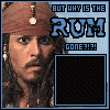
It's a nice idea, but it just doesn't fit...
First, as Caras said, red and green don't fit. When applying a color to your background try to use the uhm, pipet(Thats how it's called in dutch :S) to select the color from -in this case- the torso of the male. Then alter it a bit if you don't like it, but stay close to the original reddish color, so it fits better.

Second, the feathers on his head are cut off, this doesn't look so good, especially not in a pop-out sig. Try moving the render a bit downwards, so the feathers are full in the sig. Luckily, this won't be a big problem now, because there's nothing vital down there (At least, for him xD) that really
should be on the screen.
I'll give you another hint, perhaps for lateron.
When placing a render in a sig, try never to cut off the feet. The way you did now is fine(Except for the feathers ofcourse
) but lets say you had placed a render and put the feet 'below' the lower edge of the sig, you'd cut off his feet, which doesn't look good at all
My father taught me this, because it's a basic rule in photgraphy, try to keep it in mind for lateron


