|
|
Silkroad Online
|
|
|
Silkroad Forums
|
|
|
Affiliates
|


|
|
View unanswered posts | View active topics
  |
Page 1 of 1
|
[ 13 posts ] |
|
| Author |
Message |
|
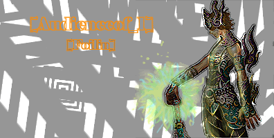
Foilin
|
Post subject: First siggy ever...  Posted: Posted: Thu May 11, 2006 7:53 pm |
|
| Frequent Member |
 |
 |
Joined: May 2006
Posts: 1200
Location: Once Xian, Now Garrosh (US). TEXAS IRL!
|
|
| Top |
|
 |
|
Nannari
|
Post subject: Posted: Fri May 12, 2006 12:28 pm |
|
| Regular Member |
 |
|
Joined: Apr 2006
Posts: 323
Location:

|
It's really not bad. Just add some different shades on the Grey, and mayb some shadowing..
I likes how you cut in the Image though, A little special
And yeah. I cant read that text at all 
_________________

dom wrote: I never use more then 20~gb, and most of that is in porn alone.
|
|
| Top |
|
|
|
crawtona
|
Post subject: Posted: Tue May 16, 2006 5:53 am |
|
| Casual Member |
 |
|
Joined: May 2006
Posts: 53
Location:

|
|
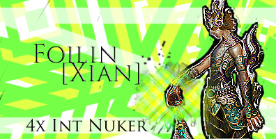
try to make the both the char and text stand out more, id say take off the filter you have on the char, and use one of the darker colors from the char for the text. otherwise it looks pretty good, i like the background.
_________________
Turvin -- lvl 16 Int hybrid -- Fable*Recruit
Currently Farming, Sp so far: 10,700
|
|
| Top |
|
|
|
Skitsefrenik
|
Post subject: Posted: Tue May 16, 2006 6:18 pm |
|
| Loyal Member |
 |
|
Joined: Apr 2006
Posts: 1692
Location: Maryland
|
can always add more cowbell 
|
|
| Top |
|
|
|
Foilin
|
Post subject: Posted: Wed May 17, 2006 7:27 pm |
|
| Frequent Member |
|
|
Joined: May 2006
Posts: 1200
Location: Once Xian, Now Garrosh (US). TEXAS IRL!
|
|
| Top |
|
|
|
antix
|
Post subject: Posted: Sun May 21, 2006 2:23 pm |
|
| Loyal Member |
 |
|
Joined: Apr 2006
Posts: 1608
Location:

|
|
I think you should get more of a complicated background. The complicated render just looks completely out of place with the two-color background. I am sorry but I really do not like this. But, if you keep working at it you will be a PS master.
_________________
This is a game, You're invited. www.lost.eu/572c4
redneck wrote: Holy crap how do u drop 1 gold piece?
|
|
| Top |
|
|
|
Foilin
|
Post subject: Posted: Mon May 22, 2006 4:15 pm |
|
| Frequent Member |
|
|
Joined: May 2006
Posts: 1200
Location: Once Xian, Now Garrosh (US). TEXAS IRL!
|
|
| Top |
|
|
|
Foilin
|
Post subject: Posted: Wed May 24, 2006 7:56 pm |
|
| Frequent Member |
|
|
Joined: May 2006
Posts: 1200
Location: Once Xian, Now Garrosh (US). TEXAS IRL!
|
|
| Top |
|
|
|
Nannari
|
Post subject: Posted: Wed May 24, 2006 8:10 pm |
|
| Regular Member |
|
|
Joined: Apr 2006
Posts: 323
Location:
|
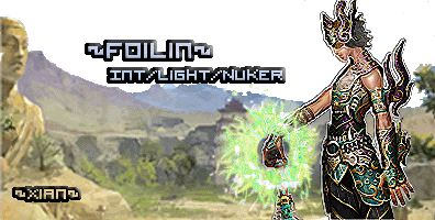
That one is very nice.. Although i think its a little too high. But good job. try using another game render sometime? 
_________________
dom wrote: I never use more then 20~gb, and most of that is in porn alone.
|
|
| Top |
|
|
|
Bakemaster
|
Post subject: Posted: Thu May 25, 2006 4:01 am |
|
| Senior Member |
 |
|
Joined: Feb 2006
Posts: 4732
Location:

|
|
I think the problem with this sig is that the effect you put on the background doesn't compliment the effect you put on the character. The background looks like an oil painting while the character looks tech-y.
_________________
LOL
|
|
| Top |
|
|
|
Foilin
|
Post subject: Posted: Thu May 25, 2006 6:27 pm |
|
| Frequent Member |
|
|
Joined: May 2006
Posts: 1200
Location: Once Xian, Now Garrosh (US). TEXAS IRL!
|
|
| Top |
|
|
|
Aya
|
Post subject: Posted: Thu May 25, 2006 9:47 pm |
|
| Valued Member |
 |
|
Joined: Apr 2006
Posts: 487
Location:
|
|
yeah the background is one of the official BG... but have you tried to do the same effect on the char (i know there is a filter for that in PS....)
_________________
Old Sig 1

|
|
| Top |
|
|
|
|
Page 1 of 1
|
[ 13 posts ] |
|
Who is online |
Users browsing this forum: No registered users and 2 guests |
|
You cannot post new topics in this forum
You cannot reply to topics in this forum
You cannot edit your posts in this forum
You cannot delete your posts in this forum
You cannot post attachments in this forum
|
|


