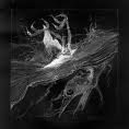
hmm, well seriously it's a nice pic, very original.
In my opinion, the bottom left corner is way too blurred. Compared to the rest of the pic, you can see the bg through the smoke, but in that corner it's just pure blurr. Also your right shoulder is a lot more "precise" ( lack of better word) then the left part ( i still can't figure out if it's good or bad...TOO MUCH SMOKE

). ohh almost forgot, i also think there is too much light. It seems almost as if it was washed too many times and became that way.
overall, it has a lot of potential. I'm sure that by just working on the colors/contrast/saturation, for a big 10-15 minutes, you can improve it greatly.
Tip*
when judging a pic, a great deal plays the "reason" you created that pic. let me explain, in the smoke tut, he used a smoking skeleton, if he would have used just a random pic of some smoke, it would be judged as less good. Why? because with that skeleton, he makes like an inside joke: hey look, i'm using a smoking dead skeleton as example on how to make smoke
. without it the pic is less worthy. (i'm re-reading my self and i'm not sure if i will be understood correctly. If not say so, and i'll try to make myself clearer.) (English is kinda my 3d language, but i still have no excuse)
p.s.
nice smoke/fog/cloud of vapors