Hostage wrote:
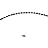
Lol, looks like someone just learned how to use the pentool! Reminds me of those little girly bikes...you know the ones that had streamer thingies on the handlebars. xD
Bad ass, I say keep them.

V3 definitely, The golden hues are very pleasant. Could have done better with the focal text however, 3-d text laying ontop of it all or something, anything just to help it keep the attention of the viewers eyes. It's very uninspirative as it is now. Your border is also making me want to throw my water bottle at your head. -.- Did you lower the opacity or just add it earlier on? Because that BG text creeping through isn't really aesthetically pleasing. Anyways, I can see what you had in mind and it's really a nice idea just needs some fine tuning.
Aww, i used pentool many times before though, just kept it really simple here. though, when you compare it to that bike~ im truely honored !
The border is an overlay btw

i thought it would look better then a strokeline you cant see through and thnx for the water ~ some refreshment never hurts

So what would you suggest? completly lose the border / make a version with the streamline handlebar lines xD and keep te text as it was in the final version ?
(noy V3, just the last one posted / the one currently in my sig)
_Panu_ wrote:
Just like Fug_Dup's sig he made. cool
eh ? never seen that sig then
its not as if i ripped his idea or so, im sure enough other people made a sig / wallpaper or whatever in close to this style
Glad you find it cool though