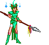
i concur. the concept is GREAT, but the character screenshot needs to redone with zoom in game so it doent pixelate as bad when resized.... and the "o" in your characters name is hard to see because of the black behind it, i am assuming you are using a pin-light or similar mask on the text layer? you could fix it by brightening the black behind it, or copy and paste a section of the greeny wild-like background from another section of the sig, behind the "o". it is also a little tall, but me'h that part doesnt realy matter to me

otherwise great work, looks good... just need to fix that character a bit and it will be sweet.