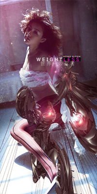
Noobs_Slayer wrote:
Its pretty nice, try Ulq green version. Lightiningg is in the good place. Once again overdid with red light and background. It's better than your previous though
Happy I pulled the lightning

Yeah I was going for a Green Version because of Ulq's eyes but for some reason the render had a "red shade".
McLovin1t wrote:
I like V2, because V2.2 is too blurred.
It's very, very good!!
Maybe blur a little less than from 2.2, and it would look perfect!
Thanks,I'll work on Blurring better on my next sig

Shomari wrote:
I'd say move the guy over to the left more and less blur cuz it seems a bit random and doesn't look natural.
True,my blur was mediocre. Sadly for the render,I coudn't move him because his right arm was cut straight(so had to put it on the side)


