Silkroad Online Forums

A community forum for the free online game Silkroad Online. Discuss Silkroad Online, read up on guides, and build your character and skills.

Faq Search Members Chat  Register Profile Login

All times are UTC


Post new topic Reply to topic  [ 6 posts ] 

What Version do you prefer?
v1 29%  29%  [ 2 ]
v2 14%  14%  [ 1 ]
v3 43%  43%  [ 3 ]
v4 14%  14%  [ 1 ]
Total votes : 7
Author Message
 Post subject: [Ex] Drake // CnC (First "Real" Subject)
PostPosted: Mon May 10, 2010 2:56 am 
Forum Legend
User avatar
Offline

Joined: Apr 2006
Posts: 7328
Location: Canada
--- New Style ; Real life focal
-- Alright its my first time with this kind of style
-- I insist,choose your favourite version
-- I'v notice I can't go as crazy(bright color,overdone effect) with Real focals,any techniques to suggest?

v1
Image

v2(+ Motion Blur)
Image

v3(+ Blurred Edges,Sharpened Center)
Image

v4( + Invert,C4D,For Fun)

Image

_________________
Image

ExSoldier/Skyve/Loki

what is life even


Top
 Profile  
 
 Post subject: Re: [Ex] Drake // CnC (First "Real" Subject)
PostPosted: Mon May 10, 2010 4:24 am 
Advanced Member
User avatar
Offline

Joined: Dec 2007
Posts: 2076
Location: ☮☮☮
Weird, I told a guy something about this earlier today.

Quote:
To be honest, it all comes down to the stock.
It's like 40% your creativity and 60% the stock.

In this case, that stock is terribly boring and unusable.
Try to choose stocks that have some flow and are interesting.

Good Luck


Too add on to your needs, I usually try to get stocks that have a plain background.
Or, cut the person I want out of a photo.
Or, smudge the bg.

But, that's for my style, some people use the existing bg to their advantage.
Experiment and see what you like.

Example
Spoiler!

_________________
Image


Top
 Profile  
 
 Post subject: Re: [Ex] Drake // CnC (First "Real" Subject)
PostPosted: Mon May 10, 2010 8:03 am 
Veteran Member
User avatar
Offline

Joined: Jul 2008
Posts: 3009
Location: лол шта
I'd still say it's a huge improvement from your other sigs. v1 is the best

_________________
Image


Top
 Profile  
 
 Post subject: Re: [Ex] Drake // CnC (First "Real" Subject)
PostPosted: Mon May 10, 2010 8:22 am 
Loyal Member
User avatar
Offline

Joined: Dec 2007
Posts: 1789
Location:
Artist Corner
Kraq wrote:
Try to choose stocks that have some flow and are interesting.

Exactly what I was thinking.
Something I was taught a looooong time ago here (by dom i think) was that you should never put your focal right smack dab in the middle of the sig, especially when it is a square image with no angle to the shot.
So:
Spoiler!

Next time you do a signature, instead of doing three or four variations of essentially the same signature, think of different layouts and then think of colors/sharpen/blur. You don't need to follow through with each, but just think about them a little and you'll find that your ideas will start to improve rapidly.

_________________
Image


Top
 Profile  
 
 Post subject: Re: [Ex] Drake // CnC (First "Real" Subject)
PostPosted: Mon May 10, 2010 11:47 pm 
Active Member
User avatar
Offline

Joined: Jul 2007
Posts: 745
Location:
Artist Corner
I agree with all the advice everyone has given you so far but I don't really understand what you were trying to do with this tag.

It looked like you used a render from this stock.
Spoiler!


Then you put it on top of a fall road stock.
Something similar to this.
Spoiler!


Then you turned it black and white and spammed a random brush and warning sign.

For the other versions you did exactly as you said.

The render, as said before, has no flow. Plus the background doesn't lend it self to create flow. If the render has no flow and the stock/background has no flow you will have a very difficult time creating flow.

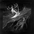
Here are two examples of good flow. The first is one of Kraq's tags and the second is one of mine.

Image
The flow in this tag starts from the tiger and flows outwards with the lightning type effects. This type of flow starts you at the focal and brings you through the rest of the tag.

Image
The flow in this tag can be seen two different ways. Some may start at the focal and follow the arrows out. Some may start at the outsides and work in toward the focal.


Both those types of flow drag the viewer through the piece very smoothly.

Here is your tag.
Image
The "flow" in this tag is all over the place. All the brushes you used draws the viewer away from the focal. As you can see the focal as no flow and the warning brush causes some conflict. The triangle point jams into the flow of the other brushes. Also the warning brush sticks out a lot and many times when I look at this tag I see the warning sign first.


For your next few tags I think it would be best if you worked on flow. Try to use more appropriate brushes and renders/stocks with some flow already in them.

Hopefully this helps.

_________________
Image


Top
 Profile  
 
 Post subject: Re: [Ex] Drake // CnC (First "Real" Subject)
PostPosted: Tue May 11, 2010 2:32 am 
Advanced Member
User avatar
Offline

Joined: Jul 2007
Posts: 2341
Location: Limbo
Also a good tip is the 1/3 rule.
1/3-black
1/3-midtones
1/3-white
Or at lease try to keep it around there, it really helps make things look nicer.
I also try to keep away from just using a brush for full effect, instead use a brush to help create a part of it.

_________________
My attention span is


Top
 Profile  
 
Display posts from previous:  Sort by  
Post new topic Reply to topic  [ 6 posts ] 

All times are UTC


Who is online

Users browsing this forum: No registered users and 2 guests


You cannot post new topics in this forum
You cannot reply to topics in this forum
You cannot edit your posts in this forum
You cannot delete your posts in this forum
You cannot post attachments in this forum

Search for:
Jump to:  
Powered by phpBB © 2000, 2002, 2005, 2007 phpBB Group