|
|
Silkroad Online
|
|
|
Silkroad Forums
|
|
|
Affiliates
|


|
|
View unanswered posts | View active topics
  |
Page 1 of 1
|
[ 23 posts ] |
|
| Author |
Message |
|
//:Protocol
|
Post subject: The Common Traps People Fall Into.  Posted: Posted: Thu Jul 27, 2006 1:25 pm |
|
| Active Member |
 |
 |
Joined: Apr 2006
Posts: 702
Location:

|
|
1 - Drop Shadow.
It doesn't make things look better generally, It makes things look more amateur if anything. Don't use it. There are MANY other ways of getting that effect, try default brushes with opacity halved?
2 - Bevel And Emboss.
I cannot say how many times I have seen people use a bevel as a border, or on an image. BEVELLING IMAGES\BORDERS does not look good. It looks tacky, and plain. Try to avoid it. Use black lines, or at the very least, a 1px black border.
3 - Outer Glow.
No. Just no. Again, use brushes if you MUST have a glow effect. It looks tacky, ESPECIALLY when you don't change the colour, and use that off-yellow colour..
Trust me, If you don't use these, your sigs will look much better In general.
=)
_________________
Click This for a Free DS. No strings attatched. Sort of..
|
|
| Top |
|
 |
|
Rockshmo
|
Post subject: Posted: Thu Jul 27, 2006 5:38 pm |
|
| Frequent Member |
 |
|
Joined: May 2006
Posts: 1062
Location: rehab
|
|
depends on what you're going for or how experienced you are.
there are a lot more mistakes people make when they start making sigs but those three are probably the main ones.
then again i could work all three of those into a decent sig so i guess it really depends on the artist.
_________________

[Sparta][Pure STR][Lvl 5x]
|
|
| Top |
|
|
|
deadpainter
|
Post subject: Posted: Thu Jul 27, 2006 8:12 pm |
|
| Casual Member |
 |
|
Joined: Jun 2006
Posts: 89
Location:

|
|
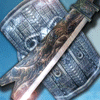
I'm no graphic designer by any stretch, but I really don't feel mine looks that bad. No glow or shadow, but I used Emboss.
|
|
|
|
|
|
V
_________________

|
|
| Top |
|
|
|
Devotia
|
Post subject: Posted: Thu Jul 27, 2006 9:31 pm |
|
| Active Member |
 |
|
Joined: Jan 2006
Posts: 822
Location:

|
|
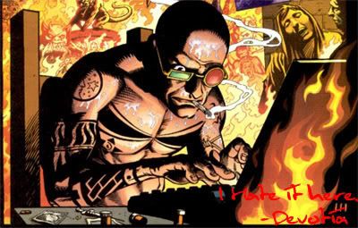
I used all 3 sucka. 5 minute sig FTW
_________________
Being a bastard works.
|
|
| Top |
|
|
|
Lance
|
Post subject: Posted: Thu Jul 27, 2006 9:40 pm |
|
| Advanced Member |
 |
|
Joined: Jul 2006
Posts: 2370
Location:

|
Rockshmo wrote: depends on what you're going for or how experienced you are.
there are a lot more mistakes people make when they start making sigs but those three are probably the main ones.
then again i could work all three of those into a decent sig so i guess it really depends on the artist.
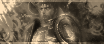
i like your first sig, the 2nd one seems abit busy, and the text doesnt really stand out ^_^
_________________

|
|
| Top |
|
|
|
Lodbrok
|
Post subject: Re: The Common Traps People Fall Into. Posted: Thu Jul 27, 2006 10:17 pm |
|
| New Member |
 |
|
Joined: Jul 2006
Posts: 26
Location:

|
//:Protocol wrote: 1 - Drop Shadow.
It doesn't make things look better generally, It makes things look more amateur if anything. Don't use it. There are MANY other ways of getting that effect, try default brushes with opacity halved?
2 - Bevel And Emboss.
I cannot say how many times I have seen people use a bevel as a border, or on an image. BEVELLING IMAGES\BORDERS does not look good. It looks tacky, and plain. Try to avoid it. Use black lines, or at the very least, a 1px black border.
3 - Outer Glow.
No. Just no. Again, use brushes if you MUST have a glow effect. It looks tacky, ESPECIALLY when you don't change the colour, and use that off-yellow colour..
Trust me, If you don't use these, your sigs will look much better In general.
=)
Not true.
It depends on how you use them.
Drop shadow can be very useful when you need something to stand out from the background, if blended correctly.
I don't like Bevel/Emboss either but that's just my taste.
Outer glow, when in low opacity and with a colour that fits the background, is a very good choice to make fonts a bit more clear if they are too blended.
Just my opinion 
_________________

|
|
| Top |
|
|
|
dom
|
Post subject: Posted: Thu Jul 27, 2006 10:17 pm |
|
Joined: Mar 2006
Posts: 9967
Location: västkustskt
|
|
I used shadow alot.
Protocol here's a tip for you: quit polygone tool.
_________________

|
|
| Top |
|
|
|
Carra
|
Post subject: Re: The Common Traps People Fall Into. Posted: Thu Jul 27, 2006 11:19 pm |
|
| Hi, I'm New Here |
|
Joined: Jun 2006
Posts: 17
Location:

|
//:Protocol wrote: 1 - Drop Shadow.
It doesn't make things look better generally, It makes things look more amateur if anything. Don't use it. There are MANY other ways of getting that effect, try default brushes with opacity halved?
2 - Bevel And Emboss.
I cannot say how many times I have seen people use a bevel as a border, or on an image. BEVELLING IMAGES\BORDERS does not look good. It looks tacky, and plain. Try to avoid it. Use black lines, or at the very least, a 1px black border.
3 - Outer Glow.
No. Just no. Again, use brushes if you MUST have a glow effect. It looks tacky, ESPECIALLY when you don't change the colour, and use that off-yellow colour..
Trust me, If you don't use these, your sigs will look much better In general.
=)
right so if we want a sig as 'good' as yours we should do none of that ?
everyone has thier own taste
|
|
| Top |
|
|
|
deadpainter
|
Post subject: Re: The Common Traps People Fall Into. Posted: Fri Jul 28, 2006 3:36 pm |
|
| Casual Member |
|
|
Joined: Jun 2006
Posts: 89
Location:
|
Carra wrote: everyone has thier own taste
QFT
_________________
|
|
| Top |
|
|
|
Rockshmo
|
Post subject: Posted: Fri Jul 28, 2006 7:51 pm |
|
| Frequent Member |
|
|
Joined: May 2006
Posts: 1062
Location: rehab
|
|
woah woah damn people.. don't turn this into a flame thread.
he was simply trying to enlighten us in the ways of Photoshop. it doesn't mean he's completely right, or completely wrong, you should all be thanking him for offering his advice.. not ridiculing him because you don't think what he said is 100% true.
_________________
[Sparta][Pure STR][Lvl 5x]
|
|
| Top |
|
|
|
deadpainter
|
Post subject: Re: The Common Traps People Fall Into. Posted: Sat Jul 29, 2006 5:07 am |
|
| Casual Member |
|
|
Joined: Jun 2006
Posts: 89
Location:
|
Padawin wrote: no one ridiculised him, dom stated a way for him to improve and carra and deadpainter are right thinkin that everyone has their own taste.... i dont see flames here
QFT 
_________________
|
|
| Top |
|
|
|
Rockshmo
|
Post subject: Posted: Sat Jul 29, 2006 8:08 pm |
|
| Frequent Member |
|
|
Joined: May 2006
Posts: 1062
Location: rehab
|
|
I never accused anyone of flaming...
_________________
[Sparta][Pure STR][Lvl 5x]
|
|
| Top |
|
|
|
Nannari
|
Post subject: Posted: Tue Aug 01, 2006 11:01 pm |
|
| Regular Member |
 |
|
Joined: Apr 2006
Posts: 323
Location:

|
|
Drop shadow and outer/inner glow functions.. I use em, mainly cause its easier than using the brush, and you get pretty much the same effect, but smoother.
_________________

dom wrote: I never use more then 20~gb, and most of that is in porn alone.
|
|
| Top |
|
|
|
Draquish
|
Post subject: Posted: Tue Aug 01, 2006 11:05 pm |
|
| Elite Member |
 |
|
Joined: Mar 2006
Posts: 6423
Location: ____
|
i mainly dont use border on my siggys because 1 im a noob and 2 it ruins the whole color scheme i got going on and it ruins the whole "feeling" of teh siggy *points at sigg*
ll
ll
ll
V
|
|
| Top |
|
|
|
Rockshmo
|
Post subject: Posted: Tue Aug 01, 2006 11:40 pm |
|
| Frequent Member |
|
|
Joined: May 2006
Posts: 1062
Location: rehab
|
Ah.. a fellow Rakion player eh? 
_________________
[Sparta][Pure STR][Lvl 5x]
|
|
| Top |
|
|
|
Draquish
|
Post subject: Posted: Wed Aug 02, 2006 12:02 am |
|
| Elite Member |
|
|
Joined: Mar 2006
Posts: 6423
Location: ____
|
Rockshmo wrote: Ah.. a fellow Rakion player eh? wats ur IGN and your class to see if i can pwon u sum time with my 1337 magic skillz ^^
|
|
| Top |
|
|
|
zanzan_xiao
|
Post subject: Posted: Wed Aug 02, 2006 3:09 am |
|
| Common Member |
 |
|
Joined: Aug 2006
Posts: 112
|
YEAH I WONDER HOW DO PEOPLE POST THE SILKROAD IMAGE AND THEN MAKE IT LOOK LIKE SOME KIND OF ART AND PLEASE CAN SOMEONE TELL ME HOW TO DO IT , THANKS YOU 
|
|
| Top |
|
|
|
bleaK
|
Post subject: Posted: Wed Aug 02, 2006 5:43 am |
|
| Active Member |
|
Joined: May 2006
Posts: 782
|
|
proto it depends on the sig style and colour and font and brush ur using and render and colour and blah balh blah
_________________
[Tranquility] [HotTextChat] - [Venice]
|
|
| Top |
|
|
|
|
Page 1 of 1
|
[ 23 posts ] |
|
Who is online |
Users browsing this forum: No registered users and 7 guests |
|
You cannot post new topics in this forum
You cannot reply to topics in this forum
You cannot edit your posts in this forum
You cannot delete your posts in this forum
You cannot post attachments in this forum
|
|