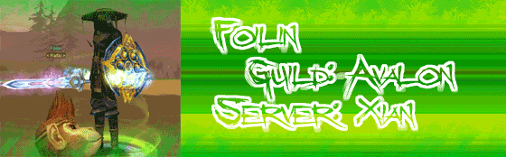
Hmm... I think the green is too bright, and the fuzzy pixels at the top and bottom of the image detract from the overall quality. Do something to make the green space less contrasting with the image on the left, and more interesting/easy on the eye since it takes up most of the room in the signature. Consider also doing something with the text... perhaps a very light blue(?) would match your character's sword and shield more closely, which would apply more of a correlation between the two halves.
I might also suggest blending the join between the left/right sides of the signature, but that would be purely personal choice I think. It doesn't look bad as it is, but I myself would maybe try to break up the straightness of the line and make it a little more interesting.
One final critique, if I may. The animation may require more frames, especially with the orb effects going around. Currently you have two/three frames that look good, then a frame with the orbs in a different stage of rotation, and then a final frame with the orbs in an entirely different place. This makes the animation feel awkward.
All in all, though, not a bad effort.

4.5/10