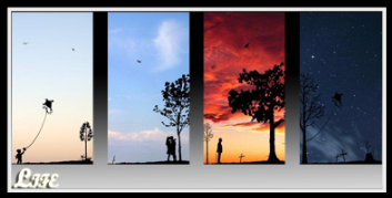
I am primarily a knowledge seeker so anything that shows interest in:
astronomy or physics
diversity or convergence
conflict or balance
(stylized is fine) added for appeal as the artist sees fit.
Text: Flash (or pop-up) is fine: SparrowHawke /// Grandpa -or- Granps two words - omit the '///'
...And the quote (from Haggle the Leper Gnome ~World of Warcraft): "I had it all! I had it all… and then I lost it! Lost… all gone… like… my… mind. My mind is like… cheese. I like cheese."
~Grandpa (thx too much!)
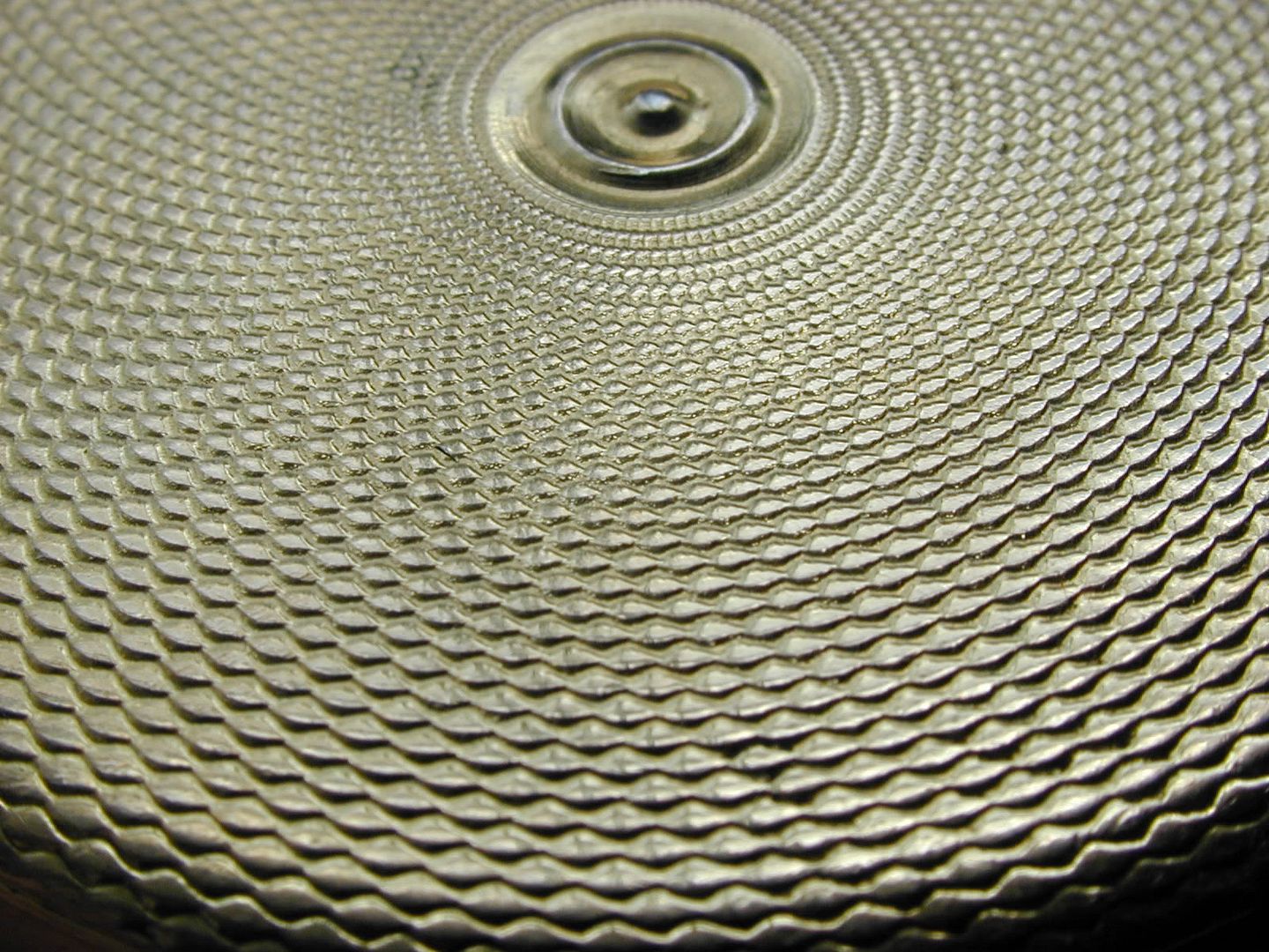
Feel free to include additional elements or change size or change color of abstract circles as you like to make it 'work' I'm easy to please
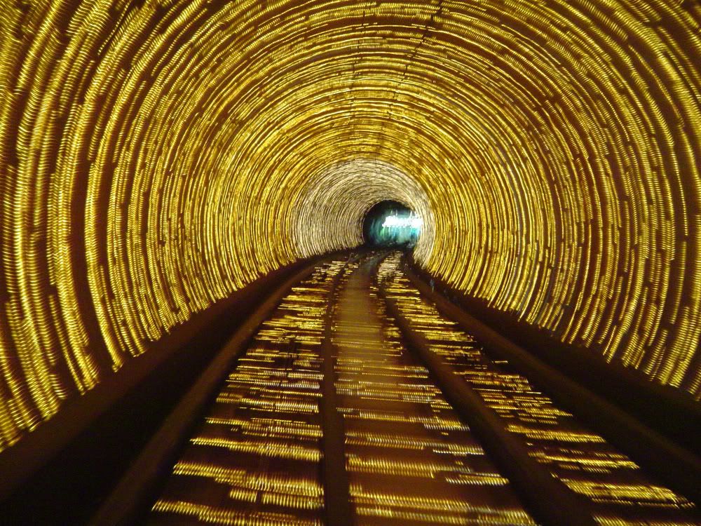
only problem i'm having atm, is that you want your sketch in there plus a tunnel of light. sketch is black on white. tunnels of light are light on black. the background will therefor contrast so much that IMO it wouldn't look good.
only problem i'm having atm, is that you want your sketch in there plus a tunnel of light. sketch is black on white. tunnels of light are light on black. the background will therefor contrast so much that IMO it wouldn't look good.
I'd like the sketch, picture frame and the little hand painted wizard dude off to the left so he is glancing down and to the right. This would leave 2/3 of the 'canvas' for other stuff? In other words you could fill the leftmost 120x150 pix with the self-pic inner man, yes? The black-out strip in the sketch was my real name sig.
but for my taste, the best sigs are sigs that are made out of several images and combined look as a whole, instead of like 3 parts of sig with 3 completely different styles which make the sig very busy. but i'll see what i can make of it :]
but for my taste, the best sigs are sigs that are made out of several images and combined look as a whole, instead of like 3 parts of sig with 3 completely different styles which make the sig very busy. but i'll see what i can make of it :]
I like your thinking - easy to please here. If I can fetch more stock (before you invest too much time) would be happy to. We could also leave the [quote] about "My mind is like cheese" as is and not try to incorporate too much there.
Last edited by Grandpa on Sun Apr 20, 2008 2:52 pm, edited 1 time in total.
but for my taste, the best sigs are sigs that are made out of several images and combined look as a whole, instead of like 3 parts of sig with 3 completely different styles which make the sig very busy. but i'll see what i can make of it :]
I like your thinking - easy to please here. If I can fetch more stock (before you invest too much time) would be happy to.
just got an idea. brb
Filling in time as I await the idea.
Perhaps what I 'should' do is withdraw my request, do some more soul searching and re-submit it (naw) I'll wait for what you have in mind ('cause I do want the self-pic inner-man img to be included) Thanks tooo much for coming this far with me. I've seen artists charge ~$100 for this kind of thing.
~Gramps
Last edited by Grandpa on Tue Apr 22, 2008 12:50 am, edited 2 times in total.
Oh, hi. WB If the cut out portion was made transparent and the cross itself was left silver it would work, and not need color. Maybe it could be positioned so that one of the colored lights (stars?) behind it showed through. Also could be reduced in size - use your eye for it, you're exceeding my expectations already. I like the stylized man (the cut-out section) more than the cross itself. Shows humanity.
Oh, hi. WB If the cut out portion was made transparent and the cross itself was left silver it would work, and not need color. Maybe it could be positioned so that one of the colored lights (stars?) behind it showed through. Also could be reduced in size - use your eye for it, you're exceeding my expectations already.
agreed on the color part, just tried if i could make it look gold. i be editing it nao <3
(lol, thx - for the link to download the PhotoShop save file nice to see (and play with) the layers
lunchtime here - grilled mahi-mahi and stir-fry ~Gpa
Wish i could fax you a bite of this ~~~> mahi is lightly brushed with italian salad dressing (not much) then seasoned with lemon pepper and a touch of cajun seasoning, flash blackened in the pan then grilled and melt in the mouth good.
easy enuf for me to see I'm outta my depth ~~> it is fun just playing with it though, feel like that karate kid: 'click-on / click-off, click-on / click-off, wax-on / wax-off'
well if you want something edited, i will do that tomorrow after work. not feeling too creative anymore now :]
You do this for a living?
You've done wonderfully well here, cin! And I'm wanting to post in the 'sig war' forum after your done, hope you don't get bored of it and thanks for offering to pick it up tomorrow. I don't think you'll need more input from me but will stay tuned to this thread just in case.
Thanks too much. If I had a daughter I'd tell her to kiss ya.
Lol, 'messed up' I feel like I snuck a peek behind the curtain to see the great and powerful oz. Looked like you were playing with mirror effects for the cross pic I took wow!
I know musicians that transform their 'mistakes' and incorporate them into the piece. To me, this defines 'art'. It ain't no technician that I'm looking for.
should I click download and save or is there a better way?
I added a swirly to the ying/yang area (thought it needed something there) then slightly blurred the outer edge and added the frame. In Gimp there is a way to define the outer 7 pixels or so and smudge them So when a matte and frame are added it gives extra depth. I know nothing of Photoshop, but tried for that effect with the blur.
My caveman tools don't let me do it right though (did it with Photobucket edit, lol) Can you do this but keep the quality, 'cause it loses the text in translation. I'd like to put the frame outside the 350x125 dimension or reduce the image only slightly if possible.What do you think? This is starting to look quite slick. Feel free to sign your work (maybe a green 'by cin '08'?) if you want.
will try that border thing when i get home this afternoon. i'm not really a big fan of large borders, but whatever floats your boat i guess i'll see what i can do with it without bringing down the quality too much ;]
will try that border thing when i get home this afternoon. i'm not really a big fan of large borders, but whatever floats your boat i guess i'll see what i can do with it without bringing down the quality too much ;]
.oO(he called me gramps) /grin
Thanks - I quick slapped that frame and like it (not the size too much) but the matte because it gives more depth. That's why I did the outer blur also.
Black outer with white or silver metallic (if that looks better) matte. This siggy is already way off the norm, I'm sure (so am I ) But I really likes it too much and you've done great for me
If you link that .psd file for me too, much appreciated. ~Gramps
Users browsing this forum: No registered users and 6 guests
You cannot post new topics in this forum You cannot reply to topics in this forum You cannot edit your posts in this forum You cannot delete your posts in this forum You cannot post attachments in this forum


