|
|
Silkroad Online
|
|
|
Silkroad Forums
|
|
|
Affiliates
|


|
|
View unanswered posts | View active topics
  |
Page 1 of 1
|
[ 22 posts ] |
|
| Author |
Message |
|
lavapockets
|
Post subject: Poster ~ Need some suggestions  Posted: Posted: Thu Mar 12, 2009 4:26 am |
|
| Frequent Member |
 |
 |
Joined: May 2007
Posts: 1126
Location: right behind you
|
|
My friend's band is headlining a show next month, and the dude who was gonna design the poster isn't doing it. So he asked me. I've never made a poster before...this one isn't done but I wanted some input on what I have so far. They asked for something "naturey" or "hippyish". It's moody ethereal rock type stuff. Anyhow...suggestions please.
EDIT: UPDATED IMAGE AT BOTTOM
_________________


Last edited by lavapockets on Sat Mar 14, 2009 6:40 am, edited 2 times in total.
|
|
| Top |
|
 |
|
Shomari
|
Post subject: Re: Poster ~ Need some suggestions Posted: Thu Mar 12, 2009 4:41 am |
|
| Advanced Member |
 |
|
Joined: Jul 2007
Posts: 2341
Location: Limbo
|
|
The orange text bothers me.
_________________
My attention span is
|
|
| Top |
|
|
|
Tasdik
|
Post subject: Re: Poster ~ Need some suggestions Posted: Thu Mar 12, 2009 5:03 am |
|
| Forum God |
 |
|
Joined: Jan 2007
Posts: 13206
Location: Life
|
Shomari wrote: The orange text bothers me. I kind of like it.
|
|
| Top |
|
|
|
Snoopy
|
Post subject: Re: Poster ~ Need some suggestions Posted: Thu Mar 12, 2009 5:05 am |
|
| Banned User |
 |
|
Joined: Dec 2007
Posts: 4016
Location: Australia
|
|
I think perhaps there's too much ground showing.
| Attachments: |
File comment: Black/White.
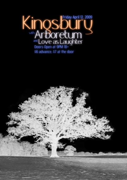
thingo.jpg [ 123.96 KiB | Viewed 3468 times ]
|
_________________
<< banned for racism. -cin >>
|
|
| Top |
|
|
|
Swindler
|
Post subject: Re: Poster ~ Need some suggestions Posted: Thu Mar 12, 2009 8:31 am |
|
| Forum God |
 |
|
Joined: Apr 2007
Posts: 11256
Location: Pimpas Paradise.
|
|
I like it, and the orange text doesnt bother me at all :>
|
|
| Top |
|
|
|
DumboDii
|
Post subject: Re: Poster ~ Need some suggestions Posted: Thu Mar 12, 2009 12:57 pm |
|
| Addicted Member |
 |
|
Joined: Sep 2008
Posts: 2961
Location: Finland
|
|
It's cool but I see some parts that are badly rendered. (Right side of the tree) Try deleting that landscape and put in just one tree brush with white or some light color. (just IMO)
_________________
Drop the beat
|
|
| Top |
|
|
|
Melez
|
Post subject: Re: Poster ~ Need some suggestions Posted: Thu Mar 12, 2009 12:59 pm |
|
| Veteran Member |
 |
|
Joined: Jul 2008
Posts: 3009
Location: лол шта
|
|
Imo, you shouldn't put it all in negative. Maybe leave the grass green, but the tree white.
_________________

|
|
| Top |
|
|
|
lavapockets
|
Post subject: Re: Poster ~ Need some suggestions Posted: Thu Mar 12, 2009 1:11 pm |
|
| Frequent Member |
|
|
Joined: May 2007
Posts: 1126
Location: right behind you
|
|
Thanks for the comments guys. I realize there's too much ground in the foreground, and something else needs to go there but I have no idea what. It needs something....
Which part of the tree are you talking about Dumbo?
_________________
|
|
| Top |
|
|
|
DumboDii
|
Post subject: Re: Poster ~ Need some suggestions Posted: Thu Mar 12, 2009 1:30 pm |
|
| Addicted Member |
|
|
Joined: Sep 2008
Posts: 2961
Location: Finland
|
 Might be just me but for me they pop out pretty much. No offence.
_________________
Drop the beat
|
|
| Top |
|
|
|
Melez
|
Post subject: Re: Poster ~ Need some suggestions Posted: Thu Mar 12, 2009 1:57 pm |
|
| Veteran Member |
|
|
Joined: Jul 2008
Posts: 3009
Location: лол шта
|
|
They don't look that bad imo, but if you think they do, just put a very small amount of blur on those edges.
EDIT: Yeah, what about some border?
_________________
Last edited by Melez on Thu Mar 12, 2009 1:59 pm, edited 1 time in total.
|
|
| Top |
|
|
|
0l3n
|
Post subject: Re: Poster ~ Need some suggestions Posted: Thu Mar 12, 2009 1:59 pm |
|
| Elite Member |
 |
|
Joined: Jun 2006
Posts: 5185
Location: Artists Corner
|
|
Id suggest something around the poster as some kind of boarder.
_________________
|
|
| Top |
|
|
|
lavapockets
|
Post subject: Re: Poster ~ Need some suggestions Posted: Thu Mar 12, 2009 3:10 pm |
|
| Frequent Member |
|
|
Joined: May 2007
Posts: 1126
Location: right behind you
|
DumboDii wrote: Might be just me but for me they pop out pretty much. No offence. None taken, of course. I am notoriously bad at spotting problem areas, hence why I come to ya'll  I like the border idea....the ground is really bothering me now. If I scrap the tree and come up with something else, does the text (colors subject to end product) look alright?
_________________
|
|
| Top |
|
|
|
DumboDii
|
Post subject: Re: Poster ~ Need some suggestions Posted: Thu Mar 12, 2009 4:54 pm |
|
| Addicted Member |
|
|
Joined: Sep 2008
Posts: 2961
Location: Finland
|
|
I like the text. But could you try the bushe thing ?
_________________
Drop the beat
|
|
| Top |
|
|
|
lavapockets
|
Post subject: Re: Poster ~ Need some suggestions Posted: Thu Mar 12, 2009 6:51 pm |
|
| Frequent Member |
|
|
Joined: May 2007
Posts: 1126
Location: right behind you
|
DumboDii wrote: I like the text. But could you try the bushe thing ? Yepp..I'll give it a shot later and repost
_________________
|
|
| Top |
|
|
|
Snoopy
|
Post subject: Re: Poster ~ Need some suggestions Posted: Fri Mar 13, 2009 6:39 am |
|
| Banned User |
|
|
Joined: Dec 2007
Posts: 4016
Location: Australia
|
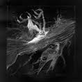
I'm guessing it is music, I don't know which genre so this might be a bit fantasy or a bit over the top, but here's a background I found the other day . Plain:  What it could look like: Anyway, just an option for you.
_________________
<< banned for racism. -cin >>
|
|
| Top |
|
|
|
Miawz
|
Post subject: Re: Poster ~ Need some suggestions Posted: Fri Mar 13, 2009 7:52 am |
|
| Hi, I'm New Here |
 |
|
Joined: Nov 2008
Posts: 24
Location: Around :3
|
Snoopy wrote: I think perhaps there's too much ground showing. ¨  I rly dont like the idea that it is supposed to be a poster, the colours are just anoying. The text looks fine tho. No offence 
_________________
Dont fear the death itself, fear what comes before it.
"Illegitimi non carborundum - Dont let the bastards grind you down."
|
|
| Top |
|
|
|
_Angels
|
Post subject: Re: Poster ~ Need some suggestions Posted: Fri Mar 13, 2009 10:50 pm |
|
| Banned User |
 |
|
Joined: Nov 2007
Posts: 707
Location:

|
i like the orange. a poster shouldnt obtain small letters tho u want people to notice ur poster from far away alrddy so i suggest u use louder colors, impact eye catching fonts and loud colors that fit with the concept:) as it is now..if i would see it..i will think its a cover of a book if i didnt read it carefully..and just flashed it bfore my eyes you know what i mean? try to think outside the box. something lunatic  lotsa loud colored brushes , and theres still alot of empty space in the poster D: try to just drop some brushes/stocks/wutever on the background and place the big tree and eyecatching text on the front. well my point is... - Dont use much text. - use fonts that u can see from far away - loud colors that match the theme/concept - filling background goodluck with the poster:)
_________________
<< banned on request. -cin >>
|
|
| Top |
|
|
|
lavapockets
|
Post subject: Re: Poster ~ Need some suggestions Posted: Sat Mar 14, 2009 2:20 am |
|
| Frequent Member |
|
|
Joined: May 2007
Posts: 1126
Location: right behind you
|
|
| Top |
|
|
|
Melez
|
Post subject: Re: Poster ~ Need some suggestions Posted: Sat Mar 14, 2009 8:55 am |
|
| Veteran Member |
|
|
Joined: Jul 2008
Posts: 3009
Location: лол шта
|
|
All in honesty, I like the first one better. And imo, remove that purple-orange grad map on your new work.
_________________
|
|
| Top |
|
|
|
_Angels
|
Post subject: Re: Poster ~ Need some suggestions Posted: Sat Mar 14, 2009 10:08 am |
|
| Banned User |
|
|
Joined: Nov 2007
Posts: 707
Location:
|
|
Lol this gave me an idea thanks to snoopy XD contest with posters :3
_________________
<< banned on request. -cin >>
|
|
| Top |
|
|
|
DumboDii
|
Post subject: Re: Poster ~ Need some suggestions Posted: Sat Mar 14, 2009 11:49 am |
|
| Addicted Member |
|
|
Joined: Sep 2008
Posts: 2961
Location: Finland
|
I like the new one !
_________________
Drop the beat
|
|
| Top |
|
|
|
lavapockets
|
Post subject: Re: Poster ~ Need some suggestions Posted: Sat Mar 14, 2009 5:59 pm |
|
| Frequent Member |
|
|
Joined: May 2007
Posts: 1126
Location: right behind you
|
|
| Top |
|
|
|
|
Page 1 of 1
|
[ 22 posts ] |
|
Who is online |
Users browsing this forum: No registered users and 3 guests |
|
You cannot post new topics in this forum
You cannot reply to topics in this forum
You cannot edit your posts in this forum
You cannot delete your posts in this forum
You cannot post attachments in this forum
|
|