|
|
Silkroad Online
|
|
|
Silkroad Forums
|
|
|
Affiliates
|


|
|
View unanswered posts | View active topics
  |
Page 1 of 1
|
[ 17 posts ] |
|
| Author |
Message |
|
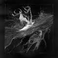
.Banshee
|
Post subject: Apple  Posted: Posted: Sun Sep 27, 2009 4:11 am |
|
| Valued Member |
 |
 |
Joined: Jan 2009
Posts: 434
Location: Artists Corner
|
_________________
Last edited by .Banshee on Mon Sep 28, 2009 11:38 pm, edited 1 time in total.
|
|
| Top |
|
 |
|
Melez
|
Post subject: Re: Apple Posted: Sun Sep 27, 2009 8:01 am |
|
| Veteran Member |
 |
|
Joined: Jul 2008
Posts: 3009
Location: лол шта
|
|
Hey, that just inspired me! Great idea, just the lighting and overall execution is lacking imo
_________________

|
|
| Top |
|
|
|
DumboDii
|
Post subject: Re: Apple Posted: Mon Sep 28, 2009 5:48 pm |
|
| Addicted Member |
 |
|
Joined: Sep 2008
Posts: 2961
Location: Finland
|
I don't like the C4D coming out from the apple. Lightning is too strong too. Other than that I think it looks good. Simple, innovative and eye pleasing. Btw when did ac die? 
_________________
Drop the beat
|
|
| Top |
|
|
|
Melez
|
Post subject: Re: Apple Posted: Mon Sep 28, 2009 6:15 pm |
|
| Veteran Member |
|
|
Joined: Jul 2008
Posts: 3009
Location: лол шта
|
Since always  We should try getting sig wars up again 
_________________
|
|
| Top |
|
|
|
Thomas42
|
Post subject: Re: Apple Posted: Mon Sep 28, 2009 6:39 pm |
|
| Active Member |
 |
|
Joined: Jun 2008
Posts: 906
Location: Budapest, Hungary
|
|
I'd certainly enter with my newfag skillz.
_________________
 The best way out - is through. The best way out - is through.
|
|
| Top |
|
|
|
Noobs_Slayer
|
Post subject: Re: Apple Posted: Mon Sep 28, 2009 8:51 pm |
|
| Frequent Member |
 |
|
Joined: Jan 2008
Posts: 1196
Location: AioN
|
DumboDii wrote: I don't like the C4D coming out from the apple. Lightning is too strong too. Other than that I think it looks good. Simple, innovative and eye pleasing. Btw when did ac die? BTW nice sig. But it's empty, the whole right side is black. Although it is clean work, no extra lines.
_________________

Sig by me.
Pride-Spatalos
|
|
| Top |
|
|
|
Melez
|
Post subject: Re: Apple Posted: Mon Sep 28, 2009 8:54 pm |
|
| Veteran Member |
|
|
Joined: Jul 2008
Posts: 3009
Location: лол шта
|
|
No one insulted anyone
_________________
|
|
| Top |
|
|
|
Noobs_Slayer
|
Post subject: Re: Apple Posted: Mon Sep 28, 2009 8:56 pm |
|
| Frequent Member |
|
|
Joined: Jan 2008
Posts: 1196
Location: AioN
|
|
It is not allowed for anyone to comment anyones works because you get flamed or whatever.
Some people just can't bare with criticizm
By the way, It seems that red effect that goes on hand, is low quallity. And i think that you failed abit with japanese text, though the text "apple" looks nice, but those jap letters doesn't go well in the sig.
Ok, now you can flame or whatever i don't care
_________________
Sig by me.
Pride-Spatalos
|
|
| Top |
|
|
|
Melez
|
Post subject: Re: Apple Posted: Mon Sep 28, 2009 9:22 pm |
|
| Veteran Member |
|
|
Joined: Jul 2008
Posts: 3009
Location: лол шта
|
Think you haven't read this: .Banshee wrote: Just say it's nice and move along. I acknowledge you have your opinions but lately all I have been seeing you do is give what seems to be constructive criticism, but really they have no substance to them, and your tags themselves are lacking certain crucial aspects. Don't try to criticize just to criticize, it's not a good look. Especially don't try to criticize photoshop veterans that know what they are doing, while you are just figuring out the basics.
He hit it right on.. Welcome back either way
_________________
|
|
| Top |
|
|
|
.Banshee
|
Post subject: Re: Apple Posted: Mon Sep 28, 2009 11:38 pm |
|
| Valued Member |
|
|
Joined: Jan 2009
Posts: 434
Location: Artists Corner
|
|
thanks for the critique Melez and Dumbo(btw your tag is win), I added some new effects, a little bit of texture, toned down the lighting source and moved it to the middle of the apple, and made text less noticeable.
_________________
|
|
| Top |
|
|
|
Noobs_Slayer
|
Post subject: Re: Apple Posted: Tue Sep 29, 2009 5:15 am |
|
| Frequent Member |
|
|
Joined: Jan 2008
Posts: 1196
Location: AioN
|
|
| Top |
|
|
|
Melez
|
Post subject: Re: Apple Posted: Tue Sep 29, 2009 5:42 am |
|
| Veteran Member |
|
|
Joined: Jul 2008
Posts: 3009
Location: лол шта
|
Version 1 is better imo. With that moved lighting you ruined the whole concept You really need some other lighting techniques
_________________
|
|
| Top |
|
|
|
Mirosuke
|
Post subject: Re: Apple Posted: Tue Sep 29, 2009 5:57 am |
|
| Forum Legend |
 |
|
Joined: Aug 2008
Posts: 6735
Location: Love the way you are.
|
V1 is better... Guys, are you blind? 
_________________
( ๏̯͡ ๏ ) ~ Hwang Mi Hee(L)あなた の運命を全うする   
WE WANT [ TORCHLIGHT II], [ TERA ONLINE], [ BLADE& SOUL] AND... [ DIABLO III].
~* Old Sigs *~[ x][ x][ x][ x]
|
|
| Top |
|
|
|
Noobs_Slayer
|
Post subject: Re: Apple Posted: Tue Sep 29, 2009 9:29 am |
|
| Frequent Member |
|
|
Joined: Jan 2008
Posts: 1196
Location: AioN
|
|
I think v2 is better, because:
I can't tell what light source technique he used ( there are 2 famous). Soft round brush is not the only technique :>
At first Japanese text was with way too high opacity, after he reduced it a bit it looks much nicier.
Effect comming from apple looks nice eighter.
That's what i think
_________________
Sig by me.
Pride-Spatalos
|
|
| Top |
|
|
|
.Banshee
|
Post subject: Re: Apple Posted: Tue Sep 29, 2009 8:36 pm |
|
| Valued Member |
|
|
Joined: Jan 2009
Posts: 434
Location: Artists Corner
|
Melez wrote: Version 1 is better imo. With that moved lighting you ruined the whole concept You really need some other lighting techniques I know I do! I suck at lighting and I ruined the whole concept of red vs. black in the apple. I'm such an idiot!
_________________
|
|
| Top |
|
|
|
BrokenSaint
|
Post subject: Re: Apple Posted: Wed Sep 30, 2009 6:21 am |
|
| Veteran Member |
 |
|
Joined: Jan 2006
Posts: 3473
Location: Stuntin'.
|
|
That's pretty cool, I like v1 better though I would've preferred a little more c4d play.
kiu.
_________________
|
|
| Top |
|
|
|
rek
|
Post subject: Re: Apple Posted: Sat Oct 03, 2009 5:59 am |
|
| Ex-Staff |
 |
|
Joined: Dec 2006
Posts: 5607
Location: darkroot garden
|
|
+1 to broken
Annnnnnnd, imo;
i think it would look better on a smaller canvas+borderless
_________________

<3
0len
|
|
| Top |
|
|
|
|
Page 1 of 1
|
[ 17 posts ] |
|
Who is online |
Users browsing this forum: No registered users and 4 guests |
|
You cannot post new topics in this forum
You cannot reply to topics in this forum
You cannot edit your posts in this forum
You cannot delete your posts in this forum
You cannot post attachments in this forum
|
|


