|
|
Silkroad Online
|
|
|
Silkroad Forums
|
|
|
Affiliates
|


|
|
View unanswered posts | View active topics
| Author |
Message |
|
Skyve
|
Post subject: Re: A Beginner's Portfolio  Posted: Posted: Fri Mar 26, 2010 2:55 am |
|
| Forum Legend |
 |
 |
Joined: Apr 2006
Posts: 7328
Location: Canada
|
------- Followed a Guide on GFXResources (Thanks Noob for link)
---- Used for the first time "Adjustment Layer",man are they fun.
--- v1,v2 or v3
-- I follow the guide @ 92%, some steps just didn't make sens to me.(Didnt know what he meant)Guide : http://sitic.deviantart.com/art/Code-Ge ... -109911088What is this Topaz Filter he's talking about,I'v looked for it everywhere. v1 v2 v2 v3 v3 As usual, I have huge problems with making C4D look good. I don't know what Im doing wrong,I just can't find the right C4D to flow with the signature As usual, I have huge problems with making C4D look good. I don't know what Im doing wrong,I just can't find the right C4D to flow with the signature  (Btw I used the Liquify technique on the C4D)
_________________
ExSoldier/Skyve/Loki
what is life even
|
|
| Top |
|
 |
|
Kraq
|
Post subject: Re: A Beginner's Portfolio Posted: Fri Mar 26, 2010 4:02 am |
|
| Advanced Member |
 |
|
Joined: Dec 2007
Posts: 2076
Location: ☮☮☮
|
|
Looks nice
You need to add some background effects tho
and some lighter tones in the smudging
_________________
|
|
| Top |
|
|
|
Skyve
|
Post subject: Re: A Beginner's Portfolio Posted: Fri Mar 26, 2010 4:39 am |
|
| Forum Legend |
|
|
Joined: Apr 2006
Posts: 7328
Location: Canada
|
I see,yeah the background is basically Clouds + Something that allowed me to use one of other PSD as a "smudge pattern" xD I'm still searching around for some nice looking C4D,Im looking for some smooth ones,not the "spiky" kind. Anyways, which Version is the best? Oh and please,what is Topaz?In the guide he suggest using it quite a few times but I coudn't find it.
_________________
ExSoldier/Skyve/Loki
what is life even
|
|
| Top |
|
|
|
Noobs_Slayer
|
Post subject: Re: A Beginner's Portfolio Posted: Fri Mar 26, 2010 7:23 am |
|
| Frequent Member |
 |
|
Joined: Jan 2008
Posts: 1196
Location: AioN
|
ExSoldier wrote: I see,yeah the background is basically Clouds + Something that allowed me to use one of other PSD as a "smudge pattern" xD I'm still searching around for some nice looking C4D,Im looking for some smooth ones,not the "spiky" kind. Anyways, which Version is the best? Oh and please,what is Topaz?In the guide he suggest using it quite a few times but I coudn't find it. guy has awesome c4d's and i am only using these in my sig since they look awesome. GL finding something
_________________

Sig by me.
Pride-Spatalos
|
|
| Top |
|
|
|
Skyve
|
Post subject: Re: A Beginner's Portfolio Posted: Sun Mar 28, 2010 8:26 am |
|
| Forum Legend |
|
|
Joined: Apr 2006
Posts: 7328
Location: Canada
|
Here we go again =) --- New Signature - Unreal Tournament -- Added a Blue C4D - v1,v2.v3 or v4. Alright,this time I really want to know if I used the C4D well. v1 v2 v2 v3 v3 v4 v4
_________________
ExSoldier/Skyve/Loki
what is life even
|
|
| Top |
|
|
|
Melez
|
Post subject: Re: A Beginner's Portfolio Posted: Sun Mar 28, 2010 9:30 am |
|
| Veteran Member |
 |
|
Joined: Jul 2008
Posts: 3009
Location: лол шта
|
|
Hmmm, your renders are always so big in your sigs, do resize them more. Also, try using less blur, you want your effects to be sharp and defined, not blurry. Keep it up in either way, if I was you, I'd go for more tuts. Just until you get a hold of basics and everything else you need to know to start your original works.
_________________

|
|
| Top |
|
|
|
Skyve
|
Post subject: Re: A Beginner's Portfolio Posted: Sun Mar 28, 2010 6:51 pm |
|
| Forum Legend |
|
|
Joined: Apr 2006
Posts: 7328
Location: Canada
|
Melez wrote: Hmmm, your renders are always so big in your sigs, do resize them more. Also, try using less blur, you want your effects to be sharp and defined, not blurry. Keep it up in either way, if I was you, I'd go for more tuts. Just until you get a hold of basics and everything else you need to know to start your original works. Thanks for the tips,what about the Blue (Blurred) C4D under the gun?Keep or Remove? Oh and what Version is the best please 
_________________
ExSoldier/Skyve/Loki
what is life even
|
|
| Top |
|
|
|
Kraq
|
Post subject: Re: A Beginner's Portfolio Posted: Sun Mar 28, 2010 8:43 pm |
|
| Advanced Member |
|
|
Joined: Dec 2007
Posts: 2076
Location: ☮☮☮
|
ExSoldier wrote: v3 Best one of the bunch. The focal is too big (as melez said) and then you have this huge flare on the top right taking up a huge portion of the tag. The background is nice and the effects. Try to expirement more and expand on effects.
_________________
|
|
| Top |
|
|
|
Skyve
|
Post subject: Re: A Beginner's Portfolio Posted: Sun Mar 28, 2010 10:20 pm |
|
| Forum Legend |
|
|
Joined: Apr 2006
Posts: 7328
Location: Canada
|
|
Thanks,took some notes. Also I never noticed that my focals where always big until you guys told me =P
_________________
ExSoldier/Skyve/Loki
what is life even
|
|
| Top |
|
|
|
Kraq
|
Post subject: Re: A Beginner's Portfolio Posted: Sun Mar 28, 2010 11:24 pm |
|
| Advanced Member |
|
|
Joined: Dec 2007
Posts: 2076
Location: ☮☮☮
|
ExSoldier wrote: Thanks,took some notes. Also I never noticed that my focals where always big until you guys told me =P It works well in your current signature, though. As long as a big focal is accomadated with a big canvas, it won't look weird.
_________________
|
|
| Top |
|
|
|
Skyve
|
Post subject: Re: A Beginner's Portfolio Posted: Sat Apr 03, 2010 6:50 pm |
|
| Forum Legend |
|
|
Joined: Apr 2006
Posts: 7328
Location: Canada
|
---- New Signature // Different Style // B&W + Color Blending Option--- V1 or V2--- At the start I had something really epic going on,but then I got all mixed up with the Background & the Lightning. I insist,please tell me what should I add/remove, I plan on opening this PSD again and work on it to improve it.v1 v2 v2
_________________
ExSoldier/Skyve/Loki
what is life even
|
|
| Top |
|
|
|
Noobs_Slayer
|
Post subject: Re: A Beginner's Portfolio Posted: Sat Apr 03, 2010 7:44 pm |
|
| Frequent Member |
|
|
Joined: Jan 2008
Posts: 1196
Location: AioN
|
|
It's better than your previous but;
Make render smaller next time (it's too large and going into all the sig),
Make background more "alive",
In every sig use light source and lightining effects.
Text should be closer focal point.
Less red color and bigger depht. I liked the red effects but I think you overdid them a little.
I'd give 5/10 for effort!
_________________
Sig by me.
Pride-Spatalos
|
|
| Top |
|
|
|
Skyve
|
Post subject: Re: A Beginner's Portfolio Posted: Sat Apr 03, 2010 8:59 pm |
|
| Forum Legend |
|
|
Joined: Apr 2006
Posts: 7328
Location: Canada
|
Noobs_Slayer wrote: It's better than your previous but;
Make render smaller next time (it's too large and going into all the sig),
Make background more "alive",
In every sig use light source and lightining effects.
Text should be closer focal point.
Less red color and bigger depht. I liked the red effects but I think you overdid them a little.
I'd give 5/10 for effort! Thanks,( v1 or v2?) Wow a lot of you guys keep telling me I have big renders,gotta seriously work on that  As for the background,what do you use for Depth?Only thing that comes to mind is Burn/Dodge & Radial Blur(Zoom). Anyways,decided I'm just gonna make another sig instead
_________________
ExSoldier/Skyve/Loki
what is life even
|
|
| Top |
|
|
|
omier
|
Post subject: Re: A Beginner's Portfolio Posted: Sat Apr 03, 2010 9:57 pm |
|
| Elite Member |
 |
|
Joined: Aug 2006
Posts: 5985
Location: ...
|
|
V1 is better.
And yeah, the render shouldn't be over half of the sig. I like when renders are 1/3 of the sig.
_________________
|
|
| Top |
|
|
|
Noobs_Slayer
|
Post subject: Re: A Beginner's Portfolio Posted: Sat Apr 03, 2010 10:18 pm |
|
| Frequent Member |
|
|
Joined: Jan 2008
Posts: 1196
Location: AioN
|
|
You need to work on depth details. Yes those tools are right, however you should use radial blur in every sig, i suggest you to use Filter - Render - Lightining Effects - Soft Omni and look on the render where the light is comming from so you could place light source right. Then play a bit with burn/dodge/sharpen/blur tools with low opacity (10 -15%) and thats how you creating a depht. One more thing try to make your backgrounds more alive and less "Fade to black". Keep it up.
_________________
Sig by me.
Pride-Spatalos
|
|
| Top |
|
|
|
Melez
|
Post subject: Re: A Beginner's Portfolio Posted: Sat Apr 03, 2010 10:23 pm |
|
| Veteran Member |
|
|
Joined: Jul 2008
Posts: 3009
Location: лол шта
|
|
The last one is too plain and lacking effects. And those red spots don't help it. Follow tuts, they help lots
_________________
|
|
| Top |
|
|
|
Mirosuke
|
Post subject: Re: A Beginner's Portfolio Posted: Mon Apr 05, 2010 11:53 pm |
|
| Forum Legend |
 |
|
Joined: Aug 2008
Posts: 6735
Location: Love the way you are.
|
Wrong placement of red spots imo. But overall -> 
_________________
( ๏̯͡ ๏ ) ~ Hwang Mi Hee(L)あなた の運命を全うする   
WE WANT [ TORCHLIGHT II], [ TERA ONLINE], [ BLADE& SOUL] AND... [ DIABLO III].
~* Old Sigs *~[ x][ x][ x][ x]
|
|
| Top |
|
|
|
Skyve
|
Post subject: Re: A Beginner's Portfolio Posted: Wed Apr 07, 2010 3:37 am |
|
| Forum Legend |
|
|
Joined: Apr 2006
Posts: 7328
Location: Canada
|
---- So this was my SigWar V2 Entry. --- Followed a Tutorial the best I could.
_________________
ExSoldier/Skyve/Loki
what is life even
|
|
| Top |
|
|
|
Skyve
|
Post subject: Re: A Beginner's Portfolio Posted: Sun Apr 11, 2010 8:03 am |
|
| Forum Legend |
|
|
Joined: Apr 2006
Posts: 7328
Location: Canada
|
BUMP? 
_________________
ExSoldier/Skyve/Loki
what is life even
|
|
| Top |
|
|
|
Kraq
|
Post subject: Re: A Beginner's Portfolio Posted: Sun Apr 11, 2010 4:14 pm |
|
| Advanced Member |
|
|
Joined: Dec 2007
Posts: 2076
Location: ☮☮☮
|
|
It's too boring.
Seems unfinished and dark.
Not that dark is bad, but doesn't work for me.
Make another sig, please!
_________________
|
|
| Top |
|
|
|
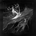
Skyve
|
Post subject: Re: A Beginner's Portfolio Posted: Mon Apr 12, 2010 5:47 am |
|
| Forum Legend |
|
|
Joined: Apr 2006
Posts: 7328
Location: Canada
|
|
| Top |
|
|
|
royalKing
|
Post subject: Re: A Beginner's Portfolio Posted: Wed Apr 21, 2010 11:23 pm |
|
| Banned User |
 |
|
Joined: Apr 2010
Posts: 9
Location: Albania
|
really nice sig keep it up 
_________________
<< banned from srf for bot support. -cin >>
|
|
| Top |
|
|
Who is online |
Users browsing this forum: Google [Bot] and 3 guests |
|
You cannot post new topics in this forum
You cannot reply to topics in this forum
You cannot edit your posts in this forum
You cannot delete your posts in this forum
You cannot post attachments in this forum
|
|


