ExSoldier wrote:
poehalcho wrote:
it's kind of boring compared some of your others =/
too much vintage colour and black stuff on the edges.
2nd looks a little better cause the green in the eyes adds some more colour.
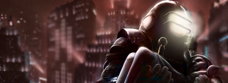
Yeah could of been way fancier,but as I said was a quick signature. Was going to some kind of "
poison drippling from his mouth" effect but coudn't find an appropriate C4D

I liked v1 more for that reason, gives the sig some personality.
You can also try to do the effects yourself. Green hard brush, motion blur, color dodge? i don't know don't be afraid to experiment (:
EDIT: Also, don't be afraid to tinker with c4ds, you can Warp them, blur them, etc to your liking.