View unanswered posts | View active topics
  |
Page 1 of 1
|
[ 7 posts ] |
|
| Author |
Message |
|
cuchulainn
|
Post subject: New sig for 6x  Posted: Posted: Sun Jun 11, 2006 12:08 am |
|
| Advanced Member |
 |
 |
Joined: Apr 2006
Posts: 2168
Location:

|
|
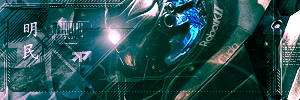
since my last one in MSpaint was pretty crappy, I made another one using GIMP for 6x
i'm pretty noob at image editing so i hope i didn't do too bad
_________________
I'm in your posts, stealing your quotes.

|
|
| Top |
|
 |
|
XMoshe
|
Post subject: Posted: Sun Jun 11, 2006 9:53 am |
|
| Ex-Staff |
 |
|
Joined: Apr 2006
Posts: 17293
Location: Ghosting around
|
|
Its a bit empty but how you did it with the grey Hotan pic is very nice *thumbs up* (gave it a 4^^)
_________________
 Props to chrisorg for the sig <3 Props to chrisorg for the sig <3
|
|
| Top |
|
|
|
whY-2G
|
Post subject: Posted: Sun Jun 11, 2006 10:12 am |
|
| Frequent Member |
|
Joined: May 2006
Posts: 1150
|
|
plain & simple is the best sometimes =D
|
|
| Top |
|
|
|
Bakemaster
|
Post subject: Posted: Sun Jun 11, 2006 10:26 am |
|
| Senior Member |
 |
|
Joined: Feb 2006
Posts: 4732
Location:

|
|
I didn't give it a 5 mostly because I like signatures to be wider, 4:1 or 7:2 ratio is nice. With yours there is dead space between the top of the thief's head and the bottom of the text. With wider, flatter sigs that's not a problem and it also makes your post take up less vertical space. The other thing that keeps it from a 5 is no transparancy.
_________________
LOL
|
|
| Top |
|
|
|
cuchulainn
|
Post subject: Posted: Tue Jun 13, 2006 10:11 am |
|
| Advanced Member |
|
|
Joined: Apr 2006
Posts: 2168
Location:
|
|
transparancy?
new to image editing so i'm not too sure what that means. if someone could explain that'd be awesome
_________________
I'm in your posts, stealing your quotes.
|
|
| Top |
|
|
|
woutR
|
Post subject: Posted: Tue Jun 13, 2006 5:08 pm |
|
| Elite Member |
 |
|
Joined: Feb 2006
Posts: 5573
Location: Netherlands
|
|
I like the sig , but I hate the text . I simply don't find any of Crayons quotes funny or good, theyre wunny. Wannabee-Funny
_________________

<<  >> >>
|
|
| Top |
|
|
|
Cuda
|
Post subject: Posted: Tue Jun 13, 2006 8:19 pm |
|
| New Member |
 |
|
Joined: Jun 2006
Posts: 45
|
|
for future reference, text never makes good filler for empty space, unless its a part of the artwork.
_________________
Name:-
Guild:-
build:-
Selling:-
|
|
| Top |
|
|
|
|
Page 1 of 1
|
[ 7 posts ] |
|
Who is online |
Users browsing this forum: No registered users and 11 guests |
|
You cannot post new topics in this forum
You cannot reply to topics in this forum
You cannot edit your posts in this forum
You cannot delete your posts in this forum
You cannot post attachments in this forum
|
|


